A color is part of a visual language of how you communicate key points, add flair and create a memorable slide or piece of marketing content.
In most situations, try to adhere to using the colors below (hex, RGB and CMYK codes):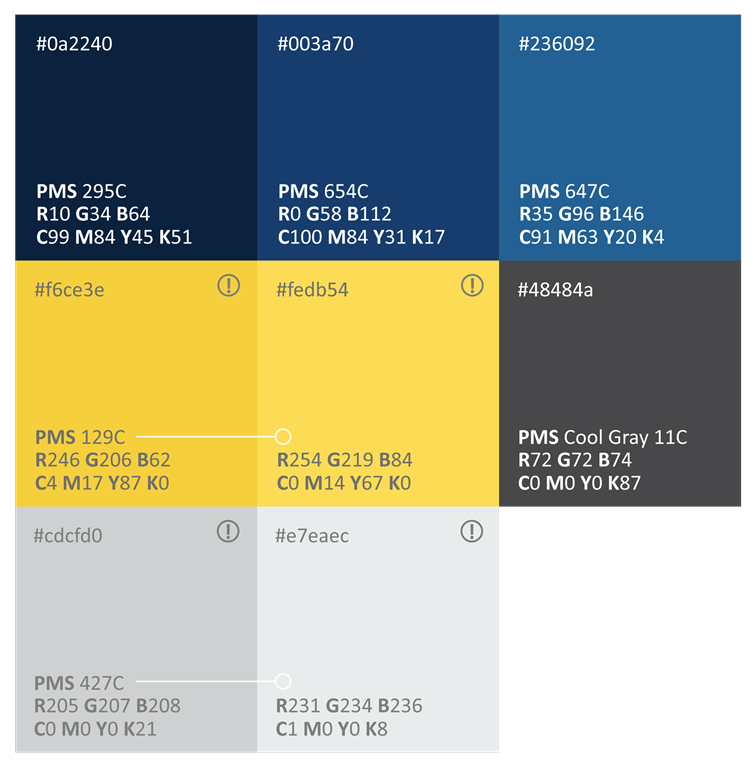
* DISCREPANCY COLORS
Either version of these colors is acceptable depending on the context (for contrast purposes or for lowering color vibration*). Since they are alternates of the same color, they should NEVER be used side by side.
Adhering to these colors enhances the appearance of cohesion within our marketing material.
There will be scenarios where other colors will be more suitable, use your best judgement on which is most appropriate.